Fieldwork (CIE IGCSE Geography)

Topic Questions

1a4 marks

Students in Italy were studying population migration. They decided to do a fieldwork investigation about migration into their country.

(a)
Before they began their fieldwork they revised key terms to do with migration.

(i)
Match the types of migrant with the correct description. One has been completed for you.

q1ai-0460_w20_qp_41
[2]
(ii)
Explain the difference between push and pull migration factors.
[2]
1b5 marks
(b)
The students visited a local town on the coast near Rome to use a questionnaire with 40 migrants who had recently arrived in Italy. The questionnaire is shown in Fig. 1.1 (below).

C0nrvavi_nov-2020-4-1-1

(i)
They used a random sampling method to select people to complete the questionnaire. Describe this method of sampling.
[2]
(ii)
Suggest three difficulties of using the questionnaire with migrants.
[3]
1c6 marks
(c)
The students wanted to test the following hypotheses:
Hypothesis 1: Most migrants come from Africa.
Hypothesis 2: Pull factors affect the decision to migrate more than push factors.

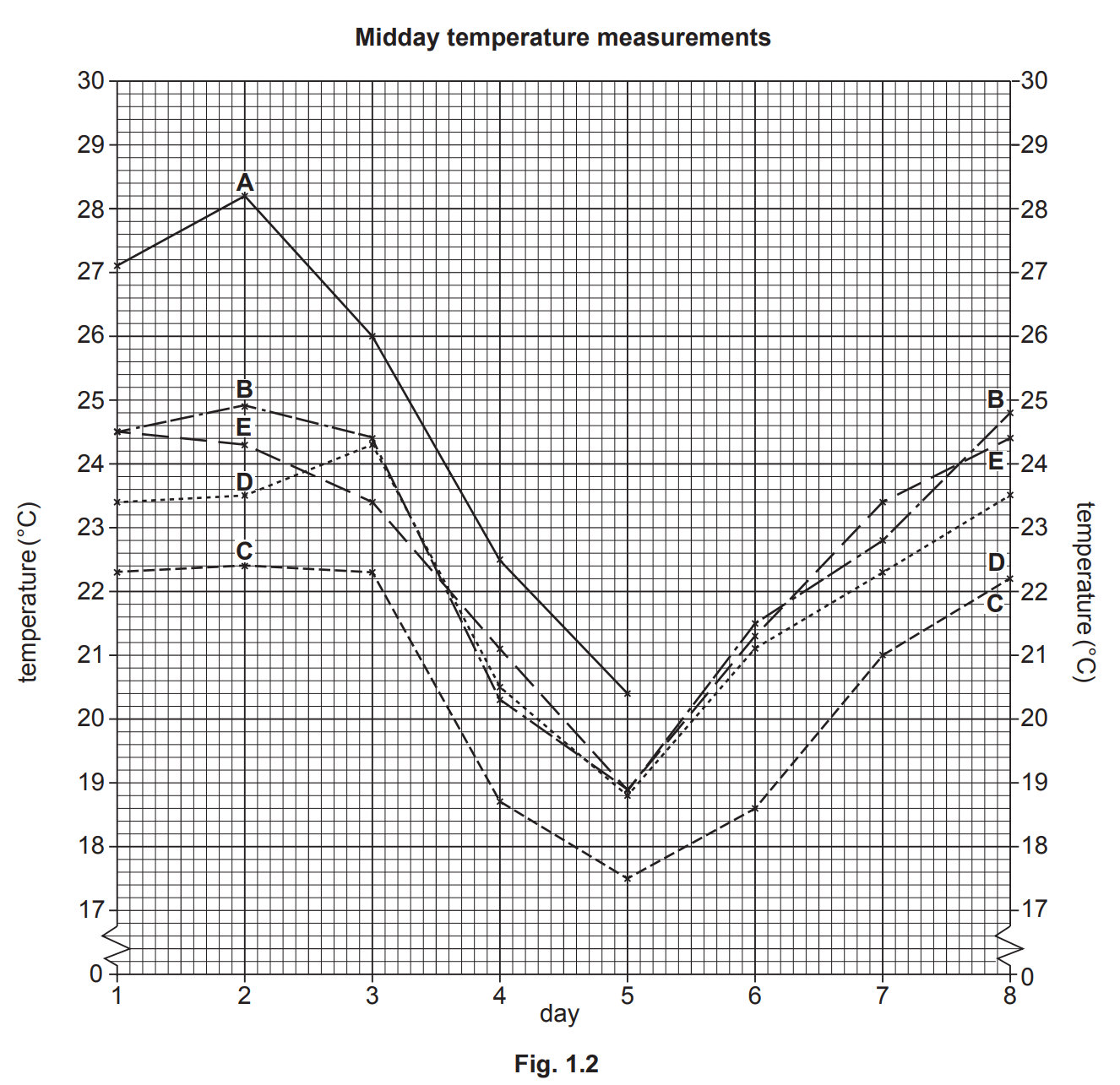
The answers to Question 1 in the questionnaire (In which country were you born and brought up?) are shown in Table 1.1 (below).

HS1lJGn5_nov-2020-4-1-1c

(i)
Use the results to draw the bar for Eritrea in Fig. 1.2 below.

q1c-0460_w20_qp_41
[1]
(ii)
What conclusion would the students make about Hypothesis 1: Most migrants come from Africa? Support your answer with evidence from Fig. 1.2 and Table 1.1.
[2]
(iii)
The students compared their results to Question 1 with secondary data collected five years earlier. What is meant by secondary data?
[1]
(iv)
The earlier results are shown in Table 1.2 (below). Identify two differences between the results in the different years.

nov-2020-4-1-1civ
[2]
1d6 marks
(d)
(i)
Table 1.3 (below) shows the results of Question 2 in the questionnaire (Which one is the most important reason why you migrated to Italy?).
nov-2020-4-1-1di
Use the results from Table 1.3 to draw and label the divided bar graph for the push factors in Fig. 1.3 below.

q1d-0460_w20_qp_41
[3]
(ii)
Do you agree with Hypothesis 2: Pull factors affect the decision to migrate more than push factors? Use evidence from Fig. 1.3 and Table 1.3 to support your decision.
[3]

1e5 marks
(e)
(i)
The results of Question 3 in the questionnaire (Which country is your final intended destination?) are shown in Table 1.4 (below).
nov-2020-4-1-1ei
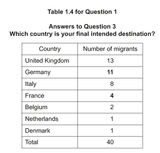
Use the results to plot the data for Germany and France in Fig. 1.4 below.
q1e-0460_w20_qp_41
[2]
(ii)
The answers to Question 3 suggest that migration is done in stages. Put the following countries in the correct order in the boxes below to show the stages of a typical migration.
  • Italy
  • Somalia (shown in Fig. 1.2)
  • United Kingdom

q1e-ii-0460_w20_qp_41

[1]

q1c-0460_w20_qp_41

(iii)
Suggest why migration takes place in stages.
[2]
1f4 marks
(f)
Give two advantages and two disadvantages of immigration for an MEDC such as Italy.

Advantages
1 ...................................
2 ...................................

Disadvantages
1 ...................................
2 ...................................
[4]

Did this page help you?

2a2 marks

Students were studying the Bradshaw model which describes how the characteristics of a river change downstream.

(a)
The table below summarises some of these characteristics. Add the following characteristics to the correct column in the table.
  • amount of load carried by the river
  • river discharge
  • size of individual load particles
Increase further downstream Decrease further downstream
channel width and depth roughness of the channel bed


[2]

2b4 marks
(b)

The students decided to investigate two other river characteristics included in the Bradshaw model by testing the following hypotheses:

Hypothesis 1: River velocity increases downstream.
Hypothesis 2: The gradient of the river bed decreases downstream.

The students carried out their fieldwork at six sites along the river.

(i)
Suggest three factors the students should have considered in choosing their fieldwork sites.
[3]
(ii)
The students made all their measurements on the same day. Suggest why this was important.
[1]
2c9 marks
(c)
(i)
To investigate Hypothesis 1: River velocity increases downstream, the students used the following equipment:

        float                                  stop-watch

        tape measure                  two ranging poles

Describe how the students used this equipment to measure river velocity.

[4]

(ii)
The results of the fieldwork are shown in Table 2.1 below.
nov-2020-4-1-2aii
Plot the results for sites 5 and 6 in Fig. 2.1 below.

q2cii-0460_w20_qp_41

[2]

(iii)
What conclusion could the students make about Hypothesis 1: River velocity increases downstream? Support your decision with evidence from Fig. 2.1 and Table 2.1.

[3]

2d8 marks
(d)
(i)
To test Hypothesis 2: The gradient of the river bed decreases downstream, the students used the method shown in Fig. 2.2 below. Describe how they measured gradient.

nov-2020-4-1-2di

[4]
(ii)
The results of the gradient measurements are shown in Table 2.1 below.

nov-2020-4-1-2aii
A student used the method in Fig. 2.3 below to draw the gradient at each site.
Use this method to show the gradient at site 5.

q2d-0460_w20_qp_41
[1]
(iii)
Which conclusion would the students make about Hypothesis 2: The gradient of the river bed decreases downstream? Tick (✓) your decision below and support it with evidence from Fig. 2.3 and Table 2.1.

  Tick (✓)
 Hypothesis 2 is true  
 Hypothesis 2 is partly true  
 Hypothesis 2 is false  
[3]
2e3 marks
(e)
When they returned to school the students evaluated their data collection methods. Suggest three improvements they could have made to increase the reliability of the velocity and gradient measurements.
[3]
2f4 marks
(f)
The students decided to investigate another characteristic included in the Bradshaw model. Describe how they could measure channel size (width and depth) at different sites downstream.
[4]

Did this page help you?

3a6 marks

Students at a school in Seattle, USA, measured atmospheric pressure, temperature and rainfall during 15 days in November. They tested the following hypotheses:

Hypothesis 1: Temperatures increase as atmospheric pressure rises and decrease as
atmospheric pressure falls.
Hypothesis 2: There is a relationship between atmospheric pressure and daily rainfall totals.

(a) (i)

The students measured the maximum and minimum temperature for each day using a thermometer like the one shown in Fig. 1.1. Explain how the students would use the thermometer to measure temperature.
 fig-1-1-q1-0460_w20_in_42  

[4]

(ii)
The results of the students’ measurements of temperature are shown in Table 1.1 

table-1-1-q1-0460_w20_in_42
Table 1.1

          Plot the maximum temperature for 13 November on the graph, Fig. 1.2 below.

q1a-ii-1-0460_w20_qp_42

q1a-ii-2-0460_w20_qp_42

[1]

(iii)
On which date in November was the largest temperature range?

 [1]


3b6 marks
(b)
The results of the students’ measurements of atmospheric pressure are shown in Table 1.1 and in Fig.1.2.

table-1-1-q1-0460_w20_in_42
Table 1.1

q1a-ii-1-0460_w20_qp_42

q1a-ii-2-0460_w20_qp_42

(i)

Which one of the following instruments would the students use to measure atmospheric pressure? Circle your answer.

                                  anemometer                     barometer                       hygrometer

      [1]

(ii)
To measure atmospheric pressure the students took readings at midday (12:00 hours) each day. Why was it important to take readings at the same time of day?

 [1]

(iii)
What conclusion did the students make about Hypothesis 1: Temperatures increase as atmospheric pressure rises and decrease as atmospheric pressure falls? Refer to both maximum and minimum temperatures and support your answer with evidence from Table 1.1 and Fig. 1.2.
[4]
3c11 marks

(c) (i)

The students used the instrument shown in Fig. 1.3 to measure daily rainfall.
Describe how the instrument is used to measure rainfall.

Fig. 1.3.
fig-1-3-q1-0460_w20_in_42
[3]

(ii)
Suggest two factors which the students should consider when choosing a site for the instrument shown in Fig. 1.3. Explain why each factor is important in choosing the site.

Factor 1
Explanation

Factor 2
Explanation
[4]

(iii)
The results of the rainfall measurements are shown in Table 1.2 (below).
Plot the rainfall for 13 November on Fig.1.4, (below).

Table 1.2
table-1-2-q1-0460_w20_in_42
Fig. 1.4.
q1c-iii-1-0460_w20_qp_42
q1c-iii-2-0460_w20_qp_42
[1]

(iv)
The students decided that Hypothesis 2: There is a relationship between atmospheric pressure and daily rainfall totals was true. Describe the relationship between atmospheric pressure and daily rainfall totals. Use evidence from Fig. 1.4 and Tables 1.1 (below) and 1.2 to support the relationship.

table-1-1-q1-0460_w20_in_42
Table 1.1

[3]
3d7 marks

(d) (i)

To extend their fieldwork the students measured the wind speed and wind direction at midday (12:00 hours). Describe how they would make these measurements.

Wind speed

Wind direction
[4]

(iii)
The results of their measurements of wind speed and wind direction are shown in Table 1.3.

table-1-3-q1-0460_w20_in_42

Table 1.3.

Complete the wind rose diagram, Fig. 1.5 below), by adding the number of days that the wind direction was from the south.

q1d-ii-0460_w20_qp_42
[1]

(iii)
What evidence from Table 1.3 supports the statement that there is a relationship between wind speed and wind direction (the direction from which the wind is blowing)?

[2]

Did this page help you?

43 marks

A class of students from a rural area of Wales was studying settlement and service provision.


(a) (i)

In class the students revised ‘hierarchy of services’. Services can be classified as high-order, middle-order and low order.
Table 2.1 below shows examples of different services in the hierarchy of services.
Complete the table by adding the following services:

                               bus stop             fire station          airport

Table 2.1

high-order service middle-order service low-order service
hospital health centre café


[2]

(ii)
Which one of the following is the correct definition of ‘low-order service’?
Tick () your answer.

  Tick ()
a service which is frequently used  
a service which is occasionally used  
a service which is rarely used  


[1]

Did this page help you?

5a5 marks

Students investigated differences in weather in a city centre square. Fig. 1.1 shows the square which is pedestrianised. They identified five sites in the square where they could measure temperature, wind direction and wind speed at midday (12:00 hours) and in the early evening on eight consecutive days.

Fig. 1.1 

fig-1-1-q1-0460_w20_in_43

The students investigated the following hypotheses:

Hypothesis 1: Midday temperatures are higher at sites A, B and C than at sites D and E.

Hypothesis 2: Wind direction and wind speed vary more at site C than at site E.

(a)
To measure the temperature the students considered using a traditional maximum-minimum thermometer at each site.

(i)
Suggest why their teacher thought that it was not a good idea to use a maximum-minimum thermometer in the city centre square when they wanted to make their measurements.
[2]
(ii)
As an alternative method the students decided to use a digital thermometer to measure temperature at each site around midday (12:00 hours) and in the early evening. Give three advantages of using a digital thermometer.
[3]
5b6 marks
(b)
The results of the students’ midday temperature measurements are shown in Table 1.1.

table-1-1-q1-0460_w20_in_43
Table 1.1

(i)
Use the results in Table 1.1, complete Fig. 1.2 below, by plotting the midday temperatures of days 6, 7 and 8 at site A.

q1b-0460_w20_qp_43
[2]
(ii)
What is your conclusion to Hypothesis 1: Midday temperatures are higher at sites A, B and C than at sites D and E? Support your decision with evidence from Fig. 1.2 and Table 1.1.
[4]
5c2 marks
(c)
Early evening temperatures in the square also varied. These temperatures are shown in Fig. 1.3.

1-3-q1-0460_w20_in_43

Fig. 1.3.

Use Fig. 1.3 to:

(i)
Describe one difference in early evening temperatures between the sites. Do not use statistics in your answer.
[1]
(ii)
Describe one difference in early evening temperatures during the eight days. Do not use statistics in your answer.
[1]
5d10 marks
(d)
To investigate Hypothesis 2: Wind direction and wind speed vary more at site C than at site E, the students took measurements at midday on each day.

(i)
What is the instrument called which is used to measure wind direction? Tick (✓) your choice below.

  Tick (✓)
wind dial  
wind gauge  
wind vane  

[1]

(ii)
The students’ results of measuring wind direction are shown in Table 1.2 (below). Use these results to complete the wind directions at site B in Fig. 1.4 below.

Table 1.2
table-1-2-q1-0460_w20_in_43
q1d-ii-0460_w20_qp_43
[2]
(iii)
Explain how an anemometer, like that shown in Fig. 1.5 (below), measures wind speed.
fig-1-5-q1-0460_w20_in_43
[2]
(iv)
The students’ results of measuring wind speed are shown in Table 1.3 (below). In Fig. 1.6 below, plot the wind speed measurements at site B on days 1 and 7.

Table 1.3
table-1-3-q1-0460_w20_in_43

q1d-iv-0460_w20_qp_43
[2]
(v)
The students decided that Hypothesis 2: Wind direction and wind speed vary more at site C than at site E, was partly true. Which part of the hypothesis is true? Tick your decision below and support your decision with data from Figs. 1.4 and 1.6 and Tables 1.2 and 1.3.

  Tick(✓)
Wind direction varies more at site C than at site E  
Wind speed varies more at site C than at site E  

[3]

5e3 marks
(e)
Look at Fig. 1.1. Suggest reasons why temperatures and wind direction and speed vary between the sites in the city centre square.
[3]

Fig. 1.1 

fig-1-1-q1-0460_w20_in_43

5f4 marks
(f)
Another feature of weather which may vary over a small area is relative humidity.

(i)
Which one of the following is the correct definition of relative humidity?
Tick your answer.

Definition Tick(✓)
the amount of moisture in the air during the day compared to the night  
the amount of moisture in the air as a percentage of the total moisture
it could hold at that temperature
 
the maximum amount of moisture in the air when it is warmed up  
the percentage of moisture in the air when it is raining compared to
when it stops raining
 

[1]

(ii)
Relative humidity is calculated by using a wet-and-dry bulb thermometer (hygrometer). This is shown in Fig. 1.7 (below). Explain how the students would use this instrument to work out relative humidity.
fig-1-7-q1-0460_w20_in_43
[3]

Did this page help you?

6a1 mark

A group of students in The Gambia visited Bafoloto quarry. The location of the quarry is shown in Fig. 2.1 (below).

fig-2-1-q2-0460_w20_in_43

Fig. 2.1

(a)
The Gambia is a small country in Africa. It is about 50km wide at the coast and narrows to only 24km wide inland. Use Fig. 2.1 to measure the length of The Gambia from west to east. Tick (✓) your answer below.

  Tick(✓)
300km  
330km  
410km  
460km  
6b3 marks
(b)
Mining and quarrying contribute a small proportion of the total GDP of The Gambia. This is shown in Table 2.1 below.

Table 2.1

Economic sector % of GDP
Services 59
Transport 16
Agriculture 15
Manufacturing 4
Construction 3
Administration 2
Mining and quarrying 1

GDP is a measurement of the total value of goods and services produced in a country.

(i)
Which one of the following sectors of industry produces the highest percentage of The Gambia’s GDP? Circle your answer below.

Primary                           Secondary                                Tertiary

[1]

(ii)
Use the data in Table 2.1 to complete the pie graph, Fig. 2.2 below.

q2bii-0460_w20_qp_43

[2]

6c2 marks
(c)
Bafoloto quarry is shown in Fig. 2.3 (below). Laterite, which is used in building, is dug out at the quarry.

fig-2-3-q2-0460_w20_in_43

Describe two features of work at the quarry which are shown in Fig. 2.3.

[2]

6d13 marks
(d)

The two hypotheses which the students tested were:

Hypothesis 1: Over half of the quarry workers are male and from The Gambia.

Hypothesis 2: People gained benefits from going to work at Bafoloto quarry.

To investigate these hypotheses the students used a questionnaire with 50 of the 400 workers at the quarry. This questionnaire is shown in Fig. 2.4 (below).

fig-2-4-q2-0460_w20_in_43


(i)
Before using the questionnaire, the students thought about the best way to make use of it. Name and describe a suitable sampling method for the students to use to select 50 workers. Explain why you have chosen this method.

Name of sampling method

Description of sampling method

Why this sampling method was chosen
[3]
(ii)
Two age groups are missing from the questionnaire in Fig. 2.4. Add the two missing age groups to the table below.

Age group
Under 20
 
 
Over 60

[2]

(iii)

Answers to Question 1 in the questionnaire (Which country do you come from?) are shown in Table 2.2 (below). Use this data to plot the numbers of male and female workers from Senegal on Fig. 2.5 below.

Table 2.2

table-2-2-q2-0460_w20_in_43

Fig. 2.5

q2d-iii-0460_w20_qp_43
[2]
(iv)
What conclusion did the students make to Hypothesis 1: Over half of the quarry workers are male and from The Gambia? Support your answer with evidence from Fig. 2.5 and Table 2.2.
[4]
(v)
Answers to Question 2 in the questionnaire (How long have you worked at the quarry?) are shown in Table 2.3 (below). Use these results to complete the divided bar graph in Fig. 2.6 below.
Table 2.3
table-2-3-q2-0460_w20_in_43

q2d-v-0460_w20_qp_43

[2]
6e3 marks
(e)
To investigate Hypothesis 2: People gained benefits from going to work at Bafoloto quarry, the students used the answers to Question 3 in the questionnaire (Why do you work at the quarry?). Some answers to Question 3 are shown in Table 2.4 below.

The students reached the conclusion that Hypothesis 2: People gained benefits from going to work at Bafoloto quarry, was generally true.

Which three answers in Table 2.4 best support their conclusion? Tick (✓) your three choices below.

Table 2.4

Answers to Question 3 (Why do you work at the quarry?)

Answers to Question 3 Tick(✓)
Quarry work is better paid than farm work  
No skills to do any other job  
Earn money at the quarry (in the dry season) when there is no work to do on the farm  
Relatives already work at the quarry  
Send money to my family back home  
Have paid for a licence to dig in the quarry  

[3]

6f8 marks
(f)
To extend their fieldwork the students wanted to find out about working conditions and safety at the quarry.

(i)
Describe how they could collect information. Do not include a questionnaire survey in your method.
[4]
(ii)
Suggest why it might be difficult for the students to collect information about working conditions and safety at the quarry.
[2]
(iii)
Suggest two possible problems of working at the quarry.
[2]

Did this page help you?

7a2 marks

Students in Portugal went to six sites along a local river to do a fieldwork investigation on changes in the river channel downstream. The river which they studied flows 13km from the Sintra Hills to the Atlantic Ocean.

(a)
From the alternatives below choose the correct terms to complete the following sentences.

                confluence               mouth            source        tributary          valley


          • A river begins at its ..............................

          • A river enters the sea at its ..............................

[2]

7b14 marks
(b)

The students investigated the following hypotheses:
Hypothesis 1: The area of the cross section of the river channel increases downstream.
Hypothesis 2: Average velocity of river flow increases downstream.

The students selected six sites along the river approximately 2 kilometres apart to do their fieldwork.

(i)
In pairs they measured the width of the river channel at each site using a tape measure.
Suggest two things the students could have done to make sure that their results were reliable.
[2]

(ii)
The results of their measurements at each site are shown in Table 1.1.
CXLhYyvh_table-1-1-q1-specimen-2020-paper-3-inserts-cie-igcse-geo
Plot the result for site 6 on Fig. 1.1, which shows how the width of the river channel varies downstream.
q1b-ii-specimen-2020-paper-3-cie-igcse-geo
[1]
(iii)
Next, they measured the depth of the river. Draw an annotated diagram to explain how they would do this.
[4]
(iv)
At each site the students measured the depth at five points across the channel. The results of their measurements at each site are shown in Table 1.1 (above).
The students drew cross sections of the channel at each site. These are shown in Fig. 1.2.
q1b-vi-specimen-2020-paper-3-cie-igcse-geo
Use the information in Table 1.1 to complete the cross section and shade in the river channel at site 4.

[3]

(v)
The method used to calculate the area of the cross section at each site is shown below.
Insert the correct figures from Table 1.1 in the calculation for site 1 below.

Calculation of the area of the cross section at site 1

Area of the cross section = width of river (metres) × average depth of river (metres)

= ....................................................................................

= 0.65 sq. metres

[1]

(vi)
The results of the students’ calculations of the area of the cross sections are shown in Table 1.2 (below). To what extent do the results support Hypothesis 1: The area of the cross section of the river channel increases downstream?
Circle your decision below and support your decision with evidence from Table 1.2 and Fig. 1.2.                                             
completely                    partially                 not at all

Table 1.2
table-1-2-q1-specimen-2020-paper-3-inserts-cie-igcse-geo
 [3]
7c8 marks
(c)(i)
To investigate Hypothesis 2: Average velocity of river flow increases downstream, the students measured the velocity at each site using the equipment shown in Fig. 1.3 (below).
Describe how they measured velocity.
Fig. 1.3fig-1-3-q1-specimen-2020-paper-3-inserts-cie-igcse-geo
 [4]
(ii)
The students calculated the average velocity of flow at each site. Their results are shown in Table 1.2 (below).
table-1-2-q1-specimen-2020-paper-3-inserts-cie-igcse-geo
Table 1.2

Plot the result for site 6 on Fig. 1.4 below.

q1c-ii-specimen-2020-paper-3-cie-igcse-geo
[1]
(iii)
The students’ conclusion was that their results did not support Hypothesis 2: Average velocity of flow increases downstream. Use evidence from Table 1.2 and Fig. 1.4 to explain why they reached this conclusion.
 [3]
7d6 marks
(d)(i)
 One student wondered if there was any relationship (correlation) between the area of the river channel cross section and average velocity at the six sites. These results are shown in Table 1.2 (below).
table-1-2-q1-specimen-2020-paper-3-inserts-cie-igcse-geo
Table 1.2

The student plotted these results on a scatter graph, Fig. 1.5 below.
Use the data in Table 1.2 to plot the results of site 6 on Fig. 1.5 below.

q1d-i-specimen-2020-paper-3-cie-igcse-geo
[1]
(ii)
The student decided that there was a partial relationship (correlation) between the area of the river channel cross section and average velocity.
Support this decision with evidence from Table 1.2 and Fig. 1.5.
[3]
(iii)
Explain why the area of the river channel cross section may affect average velocity.
 [2]

Did this page help you?

8a5 marks

Students were doing fieldwork in their local town centre. They wanted to find out how the main shopping street had changed and what people who came to shop in the town centre thought about shopping here. They tested the following hypotheses:

Hypothesis 1: Shops and services on the main shopping street have changed between 1981 and 2012.

Hypothesis 2: Most people in the local area have positive opinions about shopping in the town centre.

a)

First the students completed a land use map along the main shopping street. This map is shown in Fig. 2.1 below.

(i)
Which one of the following shops or services occupies building X on Fig. 2.1?
Tick your choice.
  Tick ()
bookshop  
clothes and shoe shop  
grocery store  
solicitor  
supermarket  
[1]
(ii)
On Fig. 2.1, use the key to show a bank at building Y.
[1]
(iii)
What type of shop or service is located 58 metres north of the church?
[1]
(iv)
Describe the distribution of houses shown on Fig. 2.1.
[1]
(v)
Identify one difference between the distribution of food and specialist non-food shops shown on Fig. 2.1.

q2a-v-specimen-2020-paper-3-cie-igcse-geo
[1]
8b7 marks
(b)
To compare the different shops and services in 1981 and 2012 the students produced Table 2.1 below.
Table 2.1
Number of shops, services and other buildings located on the main shopping street

Category 1981 2012
Shops    
Clothes and shoes 8 5
Food 20 13
Specialist non-food (including bookshop, wool
shop, chemist, mobile or cell phones, gift shop)
29 26
Other shops 3 4
Services    
Finance (including banks) 9 7
Entertainment (including restaurant, café, bar) 5 9
Other services (including doctor’s surgery,
estate agent, optician, shoe repairs, solicitor)
17 17
Office 2 1
Other buildings    
Empty (vacant) building 4 9
House (residential) 12 14
Total 109 105

(i)
The students obtained the data for 1981 from an old map of the area.
Which one of the following is the correct description of this old map?
Tick () your choice.

  Tick ()
primary source of data  
secondary source of data  
tertiary source of data  
 
[1]
(ii)
The students used Table 2.1 to draw the graph, Fig. 2.2, below.
Complete the graph to show the changes in the number of food shops and entertainment services.
q2b-ii-specimen-2020-paper-3-cie-igcse-geo
[2]
(iii)
What conclusion would the students make about Hypothesis 1: Shops and services on the main shopping street have changed between 1981 and 2012? Support your decision with evidence from Table 2.1 and Fig. 2.2.
[4]
8c3 marks
(c)

To investigate Hypothesis 2: Most people in the local area have positive opinions about shopping in the town centre, the students used a questionnaire with people on the main shopping street. The questionnaire is shown in Fig. 2.3 (below).

fig-2-3-q2-specimen-2020-paper-3-inserts-cie-igcse-geo

Fig. 2.3

(i)
The students asked people to complete their questionnaire between 10.00 hours and 12.00 hours on a working day. The results of the age group survey are shown in Table 2.2 below.

Table 2.2
Ages of people surveyed

Age group Number of people completing
the questionnaire
under 16 0
16–30 14
31–45 11
46–60 33
over 60 42

Suggest two reasons why the number of people in the different age groups varied.
 [2]
(ii)
How could the students have got a more even distribution of age groups to survey?
 [1]
8d10 marks
(d)(i)
Table 2.3 below shows the results of Question 1 in the questionnaire.

Table 2.3

Results of Question 1: How often do you shop in the town centre?

Frequency Number of answers
Every day 11
Once a week 52
Once a month 20
Less than once a month 17


Use the results from Table 2.3 and the key below to complete the pie graph, Fig. 2.4, below.
q2d-specimen-2020-paper-3-cie-igcse-geo

Did this page help you?

9a8 marks

Students in Northern Ireland were studying the topic of weather and how to measure and collect weather data. Their school had a variety of instruments to measure elements of weather, including traditional instruments and digital equipment linked to the school’s computer network.

(a)(i)
Fig. 1.1 is a diagram of a traditional weather station. What are the pieces of equipment labelled A and B?

fig-1-1-q1-0460-s20-insert-41

A .......................................................
B .......................................................
[2]
(ii)
Describe three features of equipment A and explain why each feature is important.
[6]
9b7 marks

The students noticed that the weather was forecast to change over the next three days, so they decided to take some measurements to investigate these changes.

One pair of students decided to test the following hypotheses:

Hypothesis 1: As atmospheric pressure changes rainfall amounts will vary.

Hypothesis 2: Atmospheric pressure affects the direction from which the wind blows.

The two students measured atmospheric pressure, rainfall and which direction the wind was blowing from. They took measurements every three hours using a combination of traditional and digital instruments.

(b)(i)
Which one of the following instruments is used to measure atmospheric pressure? Tick () your answer in the box below.
[1]
  Tick ()
anemometer  
barometer  
hygrometer  
thermometer  

(ii)

A rain gauge is shown in Fig. 1.1. Explain how it is used to measure rainfall.

fig-1-1-q1-0460-s20-insert-41
Fig. 1.1
 [4]
(iii)
Explain how a wind vane, which is also shown in Fig. 1.1, is used to show the direction from which the wind is blowing.
 [2]
9c3 marks
(c)

The students’ results are shown in Table 1.1 (below). Use information from the table to complete the following tasks in Fig. 1.2 below.

Table 1.1
table-1-1-q1-q1-0460-s20-insert-41

sSDzCgCk_q1c-0460-s20-qp-41-1

(i)
Complete the atmospheric pressure line graph at 16:00, 19:00 and 22:00 hours on Day 3.
[1]
(ii)
Draw the rainfall bar at 16:00 hours on Day 2.
[1]
(iii)
On which day and at what time was the following set of results recorded?

Atmospheric pressure (mb) 1002
Rainfall during the last three hours (mm) 0.3
Wind direction NNW

Day ...................................... Time ......................................
[1]
9d7 marks
(d)
Using their results, the students made conclusions about their two hypotheses.

(i)
What is your conclusion to Hypothesis 1: As atmospheric pressure changes rainfall amounts will vary? Support your conclusion with data from Fig. 1.2 and Table 1.1.
 [4]
(iii)
The students decided that Hypothesis 2: Atmospheric pressure affects the direction from which the wind blows, was partly true. Support their conclusion with evidence from Fig. 1.2 and Table 1.1.
[3]
Table 1.1
table-1-1-q1-q1-0460-s20-insert-41

sSDzCgCk_q1c-0460-s20-qp-41-1
9e5 marks
(e)
Another pair of students investigated how the amount of cloud cover and cloud type had changed over the three days.

(i)
Fig. 1.3 (below) shows two examples of the amount of cloud cover they recorded. The students recorded the amounts in oktas (eighths). Choose from the values below and fill in the correct number of oktas for each example.
[2]

Choose from the following:
1 okta              3 oktas             7 oktas              8 oktas

q1e0460-s20-qp-41
(ii)
Fig. 1.4 shows three different types of cloud recorded by the students.
Identify the cloud type in each photograph.
fig-1-4-q1-1-q1-0460-s20-insert-41
Fig. 1.4 
Type A .....................................................

Type B .....................................................

Type C .....................................................
[3]

Did this page help you?

10a2 marks
Students were studying land use in cities. They learned that there are parts of a city where one land use is dominant and covers most of the area, and this is called a land use zone. They did fieldwork to investigate land use in their local city.
(a)
To collect fieldwork data the students were divided into six groups. Each group went from the city centre outwards along main roads which were used as transect lines.

Suggest two reasons why the teacher split the class into groups.
[2]
10b4 marks
(b)
The students investigated the following hypotheses:

Hypothesis 1: Residential land use is dominant (covers most of the land area) at all distances away from the city centre.

Hypothesis 2: The percentage of commercial land use decreases as distance from the city centre increases.

Along each transect line the students used a systematic sampling method to select locations to record the land use. Their teacher told the students to:
• record the land use every 10 metres
• only record the ground floor land use
• only record the land use on one side of the road.

Give two advantages and two disadvantages of this method.
 [4]
10c3 marks
(c)
Fig. 2.1 shows the categories of land use which the students used along with examples of different types of land use.

Fig. 2.1 for Question 2
Categories of land use
Land use category Example of land use
Residential terraced house, detached house, bungalow
Industrial manufacturing, mining, assembly factory
Commercial (shops) food, take-away, furniture, market, specialist goods
Entertainment hotel, sports centre, theatre, cinema
Public buildings college, hospital, place of worship, police station
Open space farmland, park, unused land, sports field
Transport bus station, car park, railway station
Services (offices) financial, business, dentist, doctor, estate agent

Complete the table below by putting the types of land use into the correct land use category.
One example has been completed for you.

Type of land use Land use category
department store commercial
concert venue  
apartment  
library  

[3]

10d2 marks
(d)
An example of the students’ completed recording sheet along one section of a transect (201–400m) is shown in Fig. 2.2. Use these results to complete the tally chart, Fig. 2.3 below, which the students used to count the examples in the different land use categories.
Fig. 2.2
fig-2-2-q2-0460-s20-insert-41

Fig. 2.3 Tally chart
Section of transect: 201–400 metres
Land use category Tally Number
Residential //// 4
Industrial   0
Commercial (shops)    
Entertainment    
Public buildings    
Open space    
Transport    
Services (offices)
[2]
10e15 marks
(e)
When they had completed their fieldwork, the students returned to school and added up the results from all transects. They used these results to draw the divided bar graphs shown in Fig. 2.4.


Fig. 2.4

fig-2-4-q2-0460-s20-insert-41

(i)
Which distance from the city centre is shown in Table 2.1 below?
............................. metres
[1]
Table 2.1

Land use category Percentage
Residential 65
Industrial 10
Commercial (shops) 5
Entertainment 5
Public buildings 0
Open space 5
Transport 5
Services (offices) 5

(ii)

What percentage of the total land use is residential between 1001 and 1200m from the city centre?

[1]

(iii)
Describe two differences between the land use in sections 0 to 200m and 1801 to 2000m away from the city centre. Do not use statistics in your answer.
 [2]
(iv)
The students made the conclusion that Hypothesis 1: Residential land use is dominant (covers most of the land area) at all distances away from the city centre is false. Support this decision with evidence from Fig. 2.4 (above).
 [3]
(v)
Suggest why the land use changes as distance from the city centre increases.
 [4]
(vi)
What is the correct conclusion to Hypothesis 2: The percentage of commercial land use decreases as distance from the city centre increases?
Tick (3) your choice below and support your decision with evidence from Fig. 2.4.

  Tick ()
Hypothesis is true  
Hypothesis is partly true  
Hypothesis is false  
 [4]
10f4 marks
(f)
One student wanted to extend his study by investigating if the quality of the environment varied along his transect. Describe a method he could use to do this.
[4]

Did this page help you?

11a8 marks

Charity workers were doing research into differences in the health of families in Chennai, a city in India. They worked in two densely populated areas of the city which are both shown in Fig. 1.1. One was an area of unplanned housing (squatter settlement) and the other was another area of poor-quality housing which was planned and permanent.

 Fig. 1.1

fig-1-1-q1-0460-s20-insert-42

fig-1-1-q1-2-0460-s20-insert-42


The researchers wanted to find out if the following hypotheses were correct:

Hypothesis 1: Diseases were more common in the area of unplanned housing than in the area of permanent housing.

Hypothesis 2: Most residents in both areas used government health facilities.

(a)

To investigate the two hypotheses the researchers used a questionnaire with a representative sample of people who lived in each area. The sample size (number of people who answered the questionnaire) was 100 in each area.

(i)
Why did the researchers need to use a sample of people?
[1]

(ii)
Information which is collected using a questionnaire is known as ‘primary data’. What does ‘primary data’ mean?
[1]

(iii)
The following is a poor sampling method which may have been used to get a representative sample of people to answer the questionnaire.

‘Give the questionnaire to all mothers who the researchers met outside the local school.’

Explain why this is a poor method to obtain a representative sample.
[3]
(iv)
Describe a good sampling method which the researchers could use to choose a representative sample of people to answer the questionnaire. Explain why this would be a good method to use.
 [3]
11b5 marks
(b)
The questionnaire is shown in Fig. 1.2. The results of Question 1 in the questionnaire are shown in Table 1.1.

Fig. 1.2
fig-1-2-q1-0460-s20-insert-42

Table 1.1
table-1-1-q1-0460-s20-insert-42

(i)
Plot the results for typhoid in the unplanned housing area in Fig. 1.3 below.
q1b-0460-s20-qp-42
[1]
(ii)
What conclusion would the researchers make about Hypothesis 1: Diseases were more common in the area of unplanned housing than in the area of permanent housing? What evidence in Fig. 1.3 and Table 1.1 supports their conclusion?
[4]
11c5 marks
(c)

The results of Question 2 in the questionnaire are shown in Table 1.2 below

table-1-2-q2-0460-s20-insert-42

(i)

Use the results to complete the pie graph for the permanent housing area in Fig. 1.4 below.

Fig. 1.4 
q1c-0460-s20-qp-42
[2]
(iii)
The researchers agreed a conclusion that Hypothesis 2: Most residents in both areas used government health facilities was incorrect. Support this decision with evidence from Fig. 1.4 and Table 1.2.
[3]
11d4 marks
(d)(i)
The results which the researchers obtained for Question 2 (Where people go for treatment of an illness) were unexpected. One of the researchers suggested that they should have used the questionnaire in a pilot study before doing the main research. How might this have helped?
 [2]
(ii)
The researchers returned to the two areas of the city and asked people to answer another question: ‘What is the main reason you chose not to use government health facilities?’
The answers which people gave are shown in Table 1.3.
table-1-3-0460-s20-insert-42


Complete the graph, Fig. 1.5 (below), to show the answers given by people in the unplanned housing area.

q1d-ii-0460-s20-qp-42
[2]
11e4 marks
(e)
Suggest how the health of residents in poorer areas of the city could be improved.
[4]
11f4 marks
(f)
Researchers wanted to extend their study by investigating housing conditions in two areas. Describe how they could collect information about housing conditions. Do not include a questionnaire in your answer.
[4]

fig-1-1-q1-0460-s20-insert-42

fig-1-1-q1-2-0460-s20-insert-42

Did this page help you?

12a2 marks

Students were planning fieldwork on a local pebble beach. The students wanted to investigate how pebbles varied in size. The beach, which is divided into sections by groynes, is shown in Fig. 2.1.

fig-2-1-q2-0460-s20-insert-42

(a)
Fig. 2.2 (below) shows one of the groynes. Describe the groyne.
fig-2-2-q2-0460-s20-insert-42
Fig. 2.2
 [2]
12b4 marks
(b)
When the students arrived at the beach, they saw a safety notice which is shown in Fig. 2.3. Suggest four instructions their teacher would give the students to keep them safe whilst they did measurements at the sites shown in Fig. 2.4.

Fig. 2.3
fig-2-3-q2-0460-s20-insert-42

Fig. 2.4
fig-2-4-q2-0460-s20-insert-42
 [4]
12c3 marks

Groups of students worked in the different sections of the beach to investigate the following hypotheses:

Hypothesis 1: The pebbles get smaller from the cliff towards the sea.

Hypothesis 2: The pebbles get smaller from south to north in the section of the beach between two groynes.

(c)
The students collected 20 pebbles at each of nine sites shown in Fig. 2.4. They then measured the length, width and depth of each pebble. An example of this measurement is shown in Fig. 2.5.

Fig. 2.5

fig-2-5-q2-0460-s20-insert-42

(i)
Fig. 2.6 (below) shows the actual size of one of the pebbles collected. Complete the measurements of this pebble in the table below.

Fig. 2.6
q2c-i-0460-s20-qp-42
length 70   mm
width ......   mm
depth ......   mm
[2]

(ii)
In the space below calculate the average of the three measurements.

[1]
12d2 marks
(d)
The results of the students’ measurements at site M2 (on Fig. 2.4) are shown in Fig. 2.7 below.

Fig. 2.4

fig-2-4-q2-0460-s20-insert-42

q2d-0460-s20-qp-42

(i)
The average of the three measurements of pebble number 13 is 53mm. Plot this measurement in Fig. 2.7.
[1]
(ii)
Which pebble at site M2 has the largest average of the three measurements?
 [1]
12e6 marks
(e)(i)
The results of the students’ measurements for the nine sites are shown in Fig. 2.4.
Do these results support Hypothesis 1: The pebbles get smaller from the cliff towards the sea? Support your decision with evidence from Fig. 2.4.
 [3]
Fig. 2.4.
fig-2-4-q2-0460-s20-insert-42

(ii)
Explain why the size of pebbles varies in the area between the sea and the cliff.
 [3]
12f3 marks
(f)(i)
Look at Fig. 2.4.
fig-2-4-q2-0460-s20-insert-42

Which one of the following is the correct conclusion to Hypothesis 2: The pebbles get smaller from south to north in the section of the beach between two groynes? Tick (3) your decision in the box below.

  Tick ()
The conclusion is true for sites U1, U2 and U3  
The conclusion is true for sites M1, M2 and M3  
The conclusion is true for sites L1, L2 and L3  
[1]
(i)
Use data from Fig. 2.4 to support the conclusion you have chosen.
[1]
(iii)
Use data from Fig. 2.4 to show why one of the conclusions you rejected is wrong.
 [1]
12g6 marks
(g)

Movement of pebbles along a beach, which was tested in Hypothesis 2: The pebbles get smaller from south to north in the section of the beach between two groynes, is influenced by longshore drift. The students had learned that longshore drift is usually affected by the prevailing wind direction.

(i)
How could the students have checked the wind direction when they did their fieldwork?
 [2]
(ii)
Describe and explain the process of longshore drift which is shown in Fig. 2.8 (below).
fig-2-8-q2-0460-s20-insert-42
[4]
12h4 marks
(h)

As an extension activity the students measured the beach profile from the edge of the sea to the cliff. Describe how they would measure the profile using the following equipment:

• two ranging poles
• a clinometer
• a tape measure
 [4]

Did this page help you?

13a1 mark

A class of students in Nairobi was studying the processes which operate in a drainage basin. They learned that infiltration is affected by factors such as:
• how steeply the land slopes
• type of vegetation cover
• soil moisture content
• distance from a river or lake
• amount of human activity.
They did some fieldwork to investigate infiltration in an area close to Lake Naivasha in Kenya.

(a)
Identify the correct definition of infiltration below. Tick (✓) your answer.

  Tick (✓)
volume of water flowing down a river  
water soaking through bedrock  
water soaking into the soil from the ground  
speed of water flowing down a river  
atmosphere absorbing water from the sea  


13b15 marks
(b)
The students tested a variety of hypotheses. The two hypotheses chosen by one group were:

Hypothesis 1: The rate of infiltration increases as you go further from the lake.

Hypothesis 2: The rate of infiltration is greater on steeper sloping land.

The class of students did their fieldwork along transect lines going down to the shore of the lake. The class was divided into three groups and each group worked on a different transect line. These are shown in Fig. 2.1 (below).

fig-2-1-q2-0460-s20-in-43
Fig. 2.1

(i)
To investigate Hypothesis 1, the students identified six fieldwork sites at increasing distances away from the lake. At each site they measured the rate (speed) of infiltration by using the equipment shown in Fig. 2.2.

Describe how the students measured infiltration.

Fig. 2.2

fig-2-2-q2-0460-s20-in-43

[4]

(ii)
The students recorded the water level in the plastic tube every minute for 10 minutes. The results of the measurements along transect line A are shown in Table 2.1 (below). Use these results to complete the measurements for site 4 on transect A in Fig. 2.3 below.

[2]

Table 2.1

table-2-1-q2-0460-s20-in-43

Fig. 2.3

q2b-ii-0460-s20-qp-43

(iii)
Compare the fall in water level for site 1 and site 5 on transect A.

[2]

(iv)
The students calculated the infiltration rate at each site. Use the data in Table 2.1 to show the calculation which produced the result for site 2 on transect A in the space below.

Infiltration rate = begin mathsize 14px style fraction numerator Fall space in space water space level space stretchy left parenthesis mm stretchy right parenthesis over denominator Time end fraction end style

=                          

= 7.2 mm per min

   [2]

(v)

The measurements of distance from the lake and infiltration rate at the different fieldwork sites on the three transect lines are shown in Table 2.2 (below). The students plotted these results on a graph, Fig. 2.4 below.

Plot the results at site 6 on transects A and C.

Table 2.2

table-2-2-q2-0460-s20-in-43
q2b-vi-0460-s20-qp-43

[2]

(vi)

Which transect line agrees with Hypothesis 1: The rate of infiltration increases as you go further from the lake? Tick (✓) your choice below and support your answer with evidence from Fig. 2.4 and Table 2.2.

transect line Tick (✓)
A  
B  
C  


[3]

13c8 marks
(c)
To investigate Hypothesis 2: The rate of infiltration is greater on steeper sloping land, the students measured the slope gradient at each site along the transect lines.

(i)

Describe a method to measure the slope gradient. Refer to the equipment the students would use.

[4]

(ii)

The results for transect C are shown in Table 2.3. Use this data to plot the result at site 6 in Fig. 2.5 below.

[1]

Table 2.3

table-2-3-q2-0460-s20-in-43

q2c-ii-0460-s20-qp-43

(iii)
What conclusion would the students working on transect C make about Hypothesis 2:
The rate of infiltration is greater on steeper sloping land?
Support your decision with evidence from Fig. 2.5 and Table 2.3.

[3]

13d3 marks
(d)
Whilst doing their fieldwork, the students also recorded the vegetation found at each measuring site. Their results are shown in Table 2.4. How do these results show that the infiltration rate is affected by vegetation?

Table 2.4
table-2-4-q2-0460-s20-in-43
13e3 marks
(e)
The area around a lake, where students did their fieldwork, is a popular tourist area. How might people walking in the area affect vegetation infiltration rate? Explain why this would happen.
[3]

Did this page help you?

14a3 marks

Students in the UK visited a local company which made electronic products. The company is located in an inner-city area. It employs two main groups of workers, one in research and development of new products and the other in assembly of components to make the products.


Some students decided to investigate where the employees lived and any disadvantages of living there in order to test the following hypotheses:


Hypothesis 1: Research and development employees generally live in different parts of the urban area compared to the assembly work employees.


Hypothesis 2: Employees think that the journey to work is a main disadvantage of where they live.

(a)
Suggest three factors which may affect where people choose to live in an urban area.
14b3 marks

(b) (i) To collect data to test these hypotheses, the students produced a questionnaire. This is shown in Fig. 1.1

fig-1-1-q1-0460-s20-in-43


Describe a suitable method of selecting the employees to complete the questionnaire in order to get a fair, representative sample.

[2]

(ii)
Part of the recording sheet which the students used is shown in Fig. 1.2.
What is this method of recording results called?

fig-1-2-q1-0460-s20-in-43
[1]
14c11 marks
(c)
The results for Question 1 in the questionnaire are shown in Table 1.1.
table-1-1-q1-0460-s20-in-43

One student showed the results of Question 1 on two different types of maps.
These are shown in Figs. 1.3 and 1.4 

Fig. 1.3

q1c-1-0460-s20-qp-43

Fig. 1.4

q1c-2-0460-s20-qp-43

(i)

Complete Fig. 1.3 to show the numbers of research and development employees living in Formby and Kirkby.

[2]

(ii)
Complete Fig. 1.4 to show the number of assembly work employees living in Prescot.

[1]

(iii)
Choose either Fig. 1.3 or Fig. 1.4 and circle your choice below. Name the type of map and give two advantages of this type of map for showing data.

Fig. 1.3                 Fig. 1.4

Name of type of map
.........................................

Advantage 1
...........................................

Advantage 2
............................................

[3]

(iv)
Which one of the following would be another suitable method to display the results of Question 1 (In which part of the urban area do you live?) on a map of the urban area? Tick (✓) your choice.

  Tick (✓)
histogram  
kite diagram  
pictogram  


[1]

(v)
Do you agree with Hypothesis 1: Research and development employees generally live in different parts of the urban area compared to the assembly work employees? Support your conclusion with data from Figs. 1.3 and 1.4 and Table 1.1
[4]
14d7 marks
(d)
Table 1.2 shows the results of Question 2 in the questionnaire.

table-1-2-q1-0460-s20-in-43

Table 1.2

(i)
Use the results from Table 1.2 to complete Fig. 1.5 below.

[3]

q1d-0460-s20-qp-43

(ii)
Which one of the conclusions below would the students make about Hypothesis 2:
Employees think that the journey to work is a main disadvantage of where they live?
Tick (✓) your choice and support your conclusion with evidence from Fig. 1.5 and Table 1.2.

  Tick (✓)
The hypothesis is true for both groups of employees.  
The hypothesis is true for one group of employees.  
The hypothesis is true for neither group of employees  

[4]

14e6 marks
(e)
Traffic congestion may affect people’s journey to work.

(i)
Suggest two other problems which traffic congestion may cause.

   1 ..............................................................

   2 ..............................................................

[2]

(ii)

Explain why traffic congestion occurs in urban areas.

[4]

Did this page help you?

15a6 marks

A class of students investigated a local high technology industrial area. They wanted to find out about the companies located there.

(a)

The high technology industrial area is shown in Figs. 1.1 and 1.2 (below). The photograph in Fig. 1.1 shows the area in 2006 and the map in Fig. 1.2 shows it in 2016.

Fig. 1.1

fig-1-1-q1-0460-w19-qp-41

Fig 1.2

fig-1-2-q1-0460-w19-qp-41

(i)

Identify two buildings in different areas which have been constructed since 2006.
Building number ...............

[2]

(ii)
What is the number of the building labelled X on Fig. 1.1?
Building number ...............
[1]
(iii)
Figs. 1.3 and 1.4 (below) are photographs which show views of this industrial area.
Describe three features of the industrial area shown in Figs. 1.3 and 1.4.
fig-1-3-q1-0460-w19-qp-41
Fig 1.3
fig-1-4-q1-0460-w19-qp-41
Fig 1.4
 [3]
15b7 marks

The students identified the following hypotheses:

Hypothesis 1: The sectors (types) of high technology industry in the area changed between 2006 and 2016.

Hypothesis 2: High technology companies employ a highly skilled workforce.

(b)
To investigate Hypothesis 1 the students did a survey of the companies which occupied some of the buildings shown in Fig. 1.2 (below). They wanted to find out what sector of high technology industry the companies were involved in.

Fig 1.2

fig-1-2-q1-0460-w19-qp-41

(i)
Companies involved in the bio-medical sector are shaded on Fig. 1.2. Describe the distribution of these companies.
[2]
(ii)
Explain why high technology companies are usually located near to other similar companies.
[3]
(iii)
Table 1.1 (below) shows the percentage of companies in each industrial sector.

Table 1.1 
Companies in each industrial sector
High technology industries in the
industrial area
Number of
companies
in 2016
Percentage of
total number of
companies
Bio-medical 21 31
Computer / telecommunications 17 25
Energy 1 2
Environmental 3 5
Financial / business 6 9
Industrial technologies 7 10
Technical consulting 5 8
Other industries 7 10
Total 67 100

Use these results to complete Fig. 1.5 below.

q1-1biii-qp-0460-w19-qp-41
[2]
15c8 marks
(c)

To test Hypothesis 1: The sectors (types) of high technology industry in the area changed between 2006 and 2016, the students compared the results of their survey with those of a similar survey done 10 years earlier. The results of both surveys are shown in Table 1.2.

Table 1.2

Comparison of numbers of companies in each industrial sector

High technology industries in the
industrial area
Number of
companies in
2006
Number of
companies in
2016
Bio-medical 28 21
Computer / telecommunications 7 17
Energy 4 1
Environmental 26 3
Financial / business 5 6
Industrial technologies 7 7
Technical consulting 6 5
Other industries 10 7
Total 93 67

(i)
The students used the data in Table 1.2 to draw the graph, Fig. 1.6, below.
Complete the graph to show the changes in the number of bio-medical and computer/telecommunications companies.

q1-1ci-qp-0460-w19-qp-41
[2]
(ii)
What conclusion would the students make about Hypothesis 1: The sectors (types) of high technology industry in the area changed between 2006 and 2016? Support your decision with evidence from Fig. 1.6 and Table 1.2.
 [4]
(iii)
Companies in the ‘other industries’ sector shown in Table 1.1 include businesses such as a nursery (childcare centre), restaurant, and health club and gym.

Table 1.1 
Companies in each industrial sector

High technology industries in the
industrial area
Number of
companies
in 2016
Percentage of
total number of
companies
Bio-medical 21 31
Computer / telecommunications 17 25
Energy 1 2
Environmental 3 5
Financial / business 6 9
Industrial technologies 7 10
Technical consulting 5 8
Other industries 7 10
Total 67 100

Suggest two advantages for these companies of a location in this industrial area.

[2]
15d7 marks
(d)
To investigate Hypothesis 2: High technology companies employ a highly skilled workforce, the students used a questionnaire with 50 employees from different high technology companies. Their questionnaire is shown in Fig. 1.7.
fig-1-7-q1-0460-w19-qp-41

(i)
The results of Question 1 (Which one of the following is your highest academic qualification?) are shown in Table 1.3.

Table 1.3 
Answers to questionnaire

Question 1: Which one of the following is your highest academic qualification?

Qualification Number of answers
School qualification 1
Higher school qualification 7
University degree 23
Higher university degree 19

Question 2: Do you think your job is highly skilled?

Yes = 45 No = 5

Question 3: Why do you think your job is highly skilled?

Reason Number of answers
I am able to give advice and support
to other people and companies.
34
I understand how the results of my
work can be used in other industries.
33
I receive a lot of training to understand
what I need to do in my work.
38
I use complex machinery and
technology in my work.
36

Use the results to complete Fig. 1.8 below.

q1-1di-qp-0460-w19-qp-41
[2]
(ii)
The answers to Question 2 (Do you think your job is highly skilled?) are shown in Table 1.3. The reasons these people gave to answer Question 3 (Why do you think your job is highly skilled?) are also shown in Table 1.3.

The students decided that Hypothesis 2: High technology companies employ a highly skilled workforce, was correct. How do the answers to Questions 1, 2 and 3 support this conclusion?
[3]
(iii)
Suggest two benefits which employees would give in answering Question 4 (What are the main benefits which you get from your job?).
[2]
15e2 marks
(e)
Which two of the following are factors which attract high technology industries to an area?
Tick your choices in the table below.

Location factor Tick ()
Air pollution from the buildings will not affect local residents  
Links to universities in the local area  
Large quantities of raw materials nearby  
Near to the main market for the produce  
Road, rail and air transport links make the area accessible  

[2]

Did this page help you?

16a13 marks

Geography students from Bantry in south west Ireland did a weather investigation. They wanted to see if there was a link between atmospheric pressure and rainfall, and a link between wind direction and temperature.

The students agreed to investigate the following hypotheses:

Hypothesis 1: Rainfall increases when atmospheric pressure rises.

Hypothesis 2: Temperature is affected by the direction from which the wind is blowing.

(a)(i)
The students used a computerised weather station to obtain data every three hours over a period of three days. Give two advantages of using electronic recording instruments.
[2]
(ii)
Their teacher instructed the students to make some measurements using traditional instruments so they would understand how to use them.
Use arrows to match the weather feature with the correct measuring instrument in the table below. One has been completed for you.
q2-2aii-qp-0460-w19-qp-41

[2]

(iii)
In the box below draw and label a traditional rain gauge.
[3]
(iv)
Describe and explain a good position to put a rain gauge to make sure that the data collected will be accurate.
[4]
(v)
Fig. 2.1 (below) shows a weather instrument. How does this instrument measure wind direction?
fig-2-1-q2-0460-w19-qp-41
[2]

16b6 marks
(b)
The students’ measurements of atmospheric pressure and rainfall are shown in Table 2.1.

Table 2.1
Atmospheric pressure and rainfall data

  Time Measurement
number
Atmospheric
pressure
(mb)
Rainfall during
last three
hours (mm)
Day 1 10.00 1 1009 0.1
  13.00 2 1008 0.5
  16.00 3 1005 0.6
  19.00 4 1003 0.4
  22.00 5 1002 0.2
Day 2 01:00 6 1001 3.6
  04:00 7 999 1.0
  07:00 8 998 2.8
  10:00 9 997 0.8
  13:00 10 997 4.6
  16:00 11 998 3.9
  19:00 12 999 2.0
  22:00 13 1002 0.1
Day 3 01:00 14 1003 0.1
  04:00 15 1004 0.1
  07:00 16 1005 0.1
  10:00 17 1007 0.2
  13:00 18 1010 0
  16:00 19 1011 0
  19:00 20 1011 0
  22:00 21 1013 0
Day 4 01:00 22 1016 0
  04:00 23 1015 0
  07:00 24 1017 0


(i)
Use data from Table 2.1 to draw on Fig. 2.2 below the rainfall bar for 07.00 on day 2 (measurement number 8).

q2-2bi-qp-0460-w19-qp-41
[1]
(ii)
Complete the table below to show the highest and lowest atmospheric pressure measurements recorded by the students.

Highest atmospheric pressure
(mb)

Lowest atmospheric pressure
(mb)


[1]
(iii)
Do the measurements shown in Fig. 2.2 and Table 2.1 support Hypothesis 1: Rainfall increases when atmospheric pressure rises?
Support your decision with data.
[4]
16c6 marks
(c)

The students’ measurements of wind direction and temperature are shown in Table 2.2.

Table 2.2 
Wind direction and temperature data

  Time Measurement
number
Direction
wind came
from
Temperature
to nearest
degree (°C)
Day 1 10:00 1 SE 11
  13:00 2 SE 13
  16:00 3 SE 11
  19:00 4 ESE 12
  22:00 5 ESE 10
Day 2 01:00 6 SSE 9
  04:00 7 S 10
  07:00  8 S 9
  10:00 9 SSE 10
  13.00 10 SSE 12
  16:00 11 NNW 10
  19:00 12 NNW 9
  22:00 13 NW 7
Day 3 01:00 14 NNW 7
  04:00 15 NNW 6
  07:00 16 N 5
  10:00 17 N 7
  13:00 18 NNW 9
  16:00 19 NNW 8
  19:00 20 NNW 7
  22:00 21 N 4
Day 4 01:00 22 N 4
  04:00 23 N 3
  07:00 24 N 3

(i)
Use data from Table 2.2 to plot on Fig. 2.3 below the temperatures when the wind came from the east south east (ESE) direction.
q2-2ci-qp-0460-w19-qp-41
[2]
(ii)
From which direction did the wind blow most frequently?
 [1]
(iii)
The students made the conclusion that Hypothesis 2: Temperature is affected by the direction from which the wind is blowing is true. Support this conclusion with data from Fig. 2.3 and Table 2.2.
[3]
16d5 marks
(d)
Give one other weather element which the students could have measured to extend their fieldwork. (Do not write about temperature, rainfall, atmospheric pressure or wind direction.)

(i)
Weather element
[1]
(ii)
Describe how the students could collect data about the weather element named in (i) above.
[4]

Did this page help you?

17a1 mark

A class of students did fieldwork in their town. They wanted to find out where the boundary of the CBD was located. They had learned in class that this is known as ‘delimiting’ the CBD. They discussed with their teacher several fieldwork methods they could use to delimit the CBD. One group of students also investigated the quality of shops in and around the CBD.

(a)
What does CBD stand for?

C ....................... B ....................... D .......................  

The students decided to test the following hypotheses.

Hypothesis 1: Different methods of delimiting the CBD produce the same result.


   Hypothesis 2: The shopping environment in and around the CBD varies.

17b9 marks
(b)
The students used the following methods to test Hypothesis 1:
• pedestrian counts
• survey of building heights
• survey of traffic restrictions (controls)

(i)
The students did pedestrian counts at 30 sites around the town centre.
In the space below, draw a recording sheet the students could have used at each site.

[3]

(ii)
Describe an appropriate method to ensure the students obtained reliable results from the pedestrian count.

[4]

The results of the pedestrian count are shown in Fig. 1.1 below. Isolines have been drawn on the map to show the variation in the number of pedestrians.

(iii)
On Fig. 1.1, complete the isoline that shows 200 pedestrians.

q1-1biii-11-0460-42-2019-163895

[2]

17c2 marks
(c)
To collect data about the height of buildings the students selected five buildings at each of the pedestrian count sites. They then counted the number of storeys of each building and calculated an average.
Give one advantage and one disadvantage of this method of working out the height of buildings.
Advantage
...................................................................
Disadvantage
...................................................................
17d3 marks
(d)
The students marked on a map of the town two examples of traffic restrictions (controls) which they saw. These were a pedestrianised area and an area where there was restricted vehicle access. Give three other examples of traffic restrictions they could have recorded.

   1 .....................................................

   2 .....................................................

   3 .....................................................

17e2 marks
(e)
Having completed their data collection for Hypothesis 1 the students decided to use the following criteria to delimit the area of the CBD:

   • more than 300 pedestrians
   • buildings which are 3 or more storeys high
   • any traffic restrictions

Using these criteria, the students located possible boundaries of the CBD. These are shown on Fig. 1.2.

 Fig. 1.2.
fig-1-2-q1-11-0460-42-2019-163896

The students decided that Hypothesis 1: Different methods of delimiting the CBD produce the same result, was false.
Give two pieces of evidence from Fig. 1.2 to support this decision.
17f3 marks
(f)
Another group of students chose a different fieldwork method to delimit the CBD. They drew a land use map of the town centre and using this map they decided where the boundary of the CBD was.
Describe how they would carry out these tasks.
17g7 marks
(g)
To investigate Hypothesis 2: The shopping environment in and around the CBD varies, the students did a survey using the shopping environment index shown in Fig. 1.3.
fig--1-3-nov-19-42-1g
(i)

The results of the survey are shown in Table 1.1.

Table 1.1
Results of shopping environment survey

Site number Total index score
(maximum score = 30)
1 14
2 13
3 17
4 19
5 20
6 24
7 25
8 30
9 28
10 21
11 19
12 17

Draw the bar to show the shopping index score at site 12 in Fig. 1.4 below.

q1-1gi-11-0460-42-2019-163895

[1]

(ii)

What conclusion would the students make about Hypothesis 2: The shopping environment in and around the CBD varies? Support your decision with evidence from Fig. 1.4 and Table 1.1.

[4]

(iii)
Suggest two ways that the students could have improved the reliability of their shopping environment survey.
[2]

17h3 marks
(h)
After they completed their fieldwork the students discussed with their teacher how the CBD of a town changes over time. Suggest three ways that a CBD might change.

Did this page help you?

18a4 marks

Students carried out fieldwork at a popular tourist beach in south east England. The cliffs behind the beach are being eroded by the sea, especially where they are unprotected. The area is shown in Fig. 2.1.

fig--2-1-nov-19-42-2a

a)

Before they began their fieldwork, the students assessed the possible hazards they may come across and how to manage them. Their decisions are shown in Table 2.1 below.

Table 2.1

Hazard Likelihood Severity Risk Management
Slipping, tripping or
falling
4 2 8 Wear suitable footwear
and avoid slippery
surfaces
Cliff collapse 2 5 10  
Drowning in the sea 1 5 5 Beware of sea currents
and do not go into the
sea when it is rough
Hypothermia from
getting cold and wet
4 3 12  
Sharp pebbles or
objects
3 3 9 Be careful when
handling objects and do not throw pebbles
Getting lost or
isolated
2 3 6  

Likelihood of encountering hazard: 1 (little chance) to 5 (greatest chance) Severity of hazard: 1 (not likely to be dangerous) to 5 (very dangerous)
Risk = likelihood of encountering hazard × severity of hazard


(i)

Which one of the possible hazards did the students think was the greatest risk?

[1]

(ii)
Suggest different ways to reduce the risk of each of the following hazards during fieldwork:

Cliff collapse
.....................................................................
Hypothermia from getting cold and wet
.....................................................................
Getting lost or isolated
[3]
18b5 marks
(b)
The cliffs at X shown in Fig. 2.1 are being eroded by the sea at a rate of two metres per year.

fig--2-1-nov-19-42-2a
(i)
Use arrows to match the processes of sea erosion with the correct definitions in the table below. One has been completed for you.

q2-2bi-11-0460-42-2019-163895

[2]

(ii)

Explain why erosion is taking place at X but not at Y (shown in Fig. 2.1).

[3]

18c7 marks

The students tested the following hypotheses through fieldwork at two areas of the coast shown in Fig. 2.1:

fig--2-1-nov-19-42-2a
Hypothesis 1: The beach profile is steeper than the wave-cut platform profile.

Hypothesis 2: Infiltration is faster on the beach than on the wave-cut platform.

(c)

To investigate Hypothesis 1, the students measured the profile of the beach and the profile of the wave-cut platform. Fig. 2.2 shows a student doing this task.

fig-2-2-q2-11-0460-42-2019-163896

(i)
Describe how the students would measure the profile.

[4]

(ii)
The students used the results to draw the two profiles shown in Fig. 2.3
What conclusion would the students make about Hypothesis 1: The beach profile is steeper than the wave-cut platform profile? Use evidence from Fig. 2.3 to support your decision.
fig-2-3-q2-11-0460-42-2019-163896

[3]

18d6 marks
(d)

To investigate Hypothesis 2: Infiltration is faster on the beach than on the wave-cut platform, the students measured the rate at which water infiltrated (soaked into) the ground. Their method is described in Fig. 2.4 

Fig. 2.4 for Question 2
How to measure infiltration

1   Use a mallet to hammer a tube into the ground.
2   Pour water into the tube up to a height of 12cm (120mm).
3   Time for one minute.
4   Measure how many millimetres the water level in the tube has fallen.
5   Record the result and repeat the test twice more.

(i)

The students made their measurements at four points (A–D) along each profile from the sea to the cliff. To make their results reliable they measured infiltration three times at each point. Their results are shown in Table 2.2.

table-2-2-q2-11-0460-42-2019-163896

On Fig. 2.5 below plot the results of measurement 3 at points A and B along the beach profile.

q2-2di-11-0460-42-2019-163895

[2]

(ii)
What conclusion would the students make about Hypothesis 2: Infiltration is faster on the beach than on the wave-cut platform? Tick your decision below

Conclusion Tick ()
Hypothesis 2 is correct  
Hypothesis 2 is partially correct  
Hypothesis 2 is incorrect  

[1]

(iii)
Use evidence from Fig. 2.5 and Table 2.2 to support your conclusion to (d)(ii).

[2]

(iv)
Which one of the following pairs correctly explains the difference between the infiltration times on the beach and the wave-cut platform? Look at Fig. 2.1 to help you to answer.

    Tick () your choice
Groynes prevent longshore drift so sand and shingle build up a beach which water infiltrates through quickly. The wave-cut platform made of clay is at the surface due to the removal of beach material, and water infiltrates slowly.  
The beach material is clay which slows water infiltration through the wave-cut platform. The sand and shingle beach material forms a steep slope which increases infiltration.  
The wave-cut platform is uncovered and water quickly infiltrates into the ground. The beach builds up behind groynes and prevents infiltration.  

fig--2-1-nov-19-42-2a

[1]

18e8 marks
(e)
The students wanted to find out what people thought about coastal protection in the area. They produced a questionnaire which is shown in Fig. 2.6 
fig--2-6-nov-19-42-2e
The results of the questionnaire are shown in Table 2.3 

Table 2.3 
Results of the questionnaire

Question 1: Are you aware that the cliffs are being eroded?

Yes 85%
No 15%

Question 2: Do you think that the cliffs should be protected against erosion by the sea?

Yes 71%
No  21%
Don't know 8%

Question 3: Coastal protection is very expensive. Do you think it is worth spending so much money?

Yes 67%
No 27%
Don't know 6%

Question 4: Which one of these protection methods would you prefer to be used?

Groynes 38%
Breakwater 20%
Rip rap / rock armour 13%
Sea wall 29%

Question 5: Who do you think should pay for the protection work?

Local government 19%
National government 51%
Residents of the area 11%
Visitors to the area 19%

(i)
Use the results of Question 4 to complete the divided bar graph in Fig. 2.7 below.
q2-2ei-11-0460-42-2019-163895

[2]

(ii)
Use the results of Question 5 to complete the pie graph in Fig. 2.8 below.
q2-2eii-11-0460-42-2019-163895

[2]

(iii)

Write a report about coastal protection based on what the students found out from their questionnaire.
Refer to the results in Table 2.3 but do not copy them out.

[4]

Did this page help you?

19a1 mark

Students from Brazil who lived near Tijuca National Park did some fieldwork to study the tropical rainforest ecosystem. They visited three sites which are described and located in Fig. 1.1

fig-1-1-q1-11-0460-43-2019-163898

a)
The vegetation in the tropical rainforest adapts to the climate. Use arrows to match the vegetation feature with the reason for its adaptation. One has been completed for you.

q1-1a-0460-w19-qp-43
The students decided to investigate the effect of vegetation cover at the three sites. They agreed on the following hypotheses:
Hypothesis 1: Humidity is greater where there is more vegetation cover.
Humidity is the amount of water vapour in the air.

Hypothesis 2: Infiltration is quicker where there is more vegetation cover.
19b8 marks

(i) To obtain data the students made each of their measurements five times at each site.
Explain why this would make their results more reliable.

[2]


(ii) To measure the amount of vegetation cover the students used the piece of equipment shown in Fig. 1.2 

fig-1-2-q1-11-0460-43-2019-163898

What is this piece of equipment called? Tick (✓) your answer below.

  Tick (✓)
barometer  
callipers  
clinometer  
quadrat  
ruler  

[1]

(iii) To measure humidity the students did a simple test which a student described in his fieldwork notebook, Fig. 1.3. Suggest one weakness of this test. 

fig-1-3-q1-11-0460-43-2019-163898

[1]


(iv) The students also measured the time it took for water to infiltrate (soak into) the ground. Describe a fieldwork method to measure infiltration. Refer to equipment which could be used.


[4]

19c4 marks

(c) The results of the students’ measurements are shown in Table 1.1.

Table 1.1 for Question 1
Results of students’ measurements

Measurement 1 Measurement 2 Measurement 3 Measurement 4 Measurement 5 Average


Site A

Percentage of vegetation cover 36 20 8 38 19 24.2
Percentage of bare ground 64 80 92 62 81 75.8
Humidity measurement (seconds) 60 52 46 49 56 52.6
Infiltration time (seconds) 36 40 58 60 44  47.6

Site B

Percentage of vegetation cover 65 48 68 28 12 44.2
Percentage of bare ground 35 52 32 72 88 55.8
Humidity measurement (seconds) 100 175 135 129 125 132.8
Infiltration time (seconds) 25 35 21 48 52  

Site C

Percentage of vegetation cover 72 68 80 57 65 68.4
Percentage of bare ground 28 32 20 43 35 31.6
Humidity measurement (seconds) 96 90 103 115 84 97.6
Infiltration time (seconds) 20 28 25 22 30 25.0

(i)
Which site has the highest amount of vegetation cover? Circle your answer.

site A    site B    site C

[1]

(ii)
One set of measurement results is shown below.

Percentage of vegetation cover = 68
Percentage of bare ground = 32
Humidity measurement = 90 seconds
Infiltration time = 28 seconds

At which site and for which measurement (1–5) were these results recorded?
Site ..............
Measurement number ..............

[1]

(iii) Use the results in Table 1.1 to calculate the average infiltration time at site B. Show your calculation below.

Answer = ............................ seconds

[2]

19d10 marks
d)
Using their results from Table 1.1 the students plotted the graphs shown in Fig. 1.4 below.

q1-1d-0460-w19-qp-43

(i) Use the information in Table 1.1 to plot the following on Fig. 1.4:

• the percentage of vegetation cover and the percentage of bare ground in
measurement 3 at site C
• how long the cobalt chloride paper took to turn pink (humidity measurement) in
measurement 5 at site B
• the infiltration time in measurement 5 at site C.

 [3]


(ii) Before they made a conclusion to Hypothesis 1 the teacher reminded the students that the less time the paper took to turn pink the greater the humidity of the air. What conclusion would the students make about Hypothesis 1: Humidity is greater where there is more vegetation cover? Support your decision with evidence from Fig. 1.4 and Table 1.1. 

[4]

(iii) The students decided that Hypothesis 2: Infiltration is quicker where there is more vegetation cover was correct.

What evidence from Fig. 1.4 and Table 1.1 supports their conclusion?

[3]

19e3 marks
e)
Suggest why infiltration times are different at sites A and C. Look again at Fig. 1.1 to help you to answer.

Fig. 1.1

fig-1-1-q1-11-0460-43-2019-163898

[3]
19f3 marks
f)
Whilst doing their fieldwork the students saw many different plant species in the tropical rainforest. As an extension activity, they returned to their three fieldwork sites and counted the number of different species using the reference sheet shown in Fig. 1.5. Their results are shown in Table 1.2 (below).

fig-1-5-q1-11-0460-43-2019-163898
Table 1.2 for Question 1
Different species* identified by students
Species
reference
number
1 2 3 4 5 6 7 8 9 10 11 12 13
Site A              
Site B            
Site C        

*Species reference number in Fig. 1.5

Key
✓ species seen at the site


(i) One student wanted to show the number of different plant species seen at each site. Which one of the following would be suitable to show the information in Table 1.2? Tick (✓) your choice.
   Tick (✓)
Bar graph  
Flow diagram  
Kite diagram  
Radial graph  
Triangular graph  

[1]

(ii) Suggest two reasons why the number and types of plant species vary between the sites. Look again at Fig. 1.1 to help you to answer.
1 ........................................................................................................................................

2 ........................................................................................................................................

 [2]

Did this page help you?

20a6 marks

Students in Mauritius, an island in the Indian Ocean, were studying tourism. Tourism is an important industry in Mauritius and earns much foreign income.

a)
Fig. 2.1 shows the number of international tourists who visited Mauritius between 1995 and 2015.

(i) How many international tourists visited Mauritius in 2005?
fig-2-1-q2-11-0460-43-2019-163898

 [1]

(ii) Between which two years was there a decline in the number of international tourists visiting Mauritius?

[1]


(iii) Suggest four reasons why the number of international tourists visiting LEDCs, such as Mauritius, has increased in the last 30 years.


1 ........................................................................................................................................

2 ........................................................................................................................................

3 ........................................................................................................................................

4 ........................................................................................................................................

 [4]

20b4 marks

The students decided to investigate why international tourists came to Mauritius and what impact tourists had on people who lived on the island. Their two hypotheses were:


   Hypothesis 1: The physical landscape attracts more tourists to Mauritius than the human landscape.

   Hypothesis 2: Tourism is a good development for the residents of Mauritius.

b)
To investigate Hypothesis 1 the students produced a questionnaire. This is shown in Fig. 2.2 

fig-2-2-q2-11-0460-43-2019-163898
(i) When they showed their questionnaire to their teacher she suggested that before using the questionnaire they should ask:
‘Are you a tourist or do you live in Mauritius?’
Why do you think the teacher made this suggestion?

(ii) The answers to Question 1 (Which continent do you come from?) are shown in Table 2.1 below.

Table 2.1
Answers to Question 1

Continent Number of tourists
Asia 17
Africa 14
Europe 55
Australia 2
North America 11
South America 1
Total 100

Using Table 2.1, give two conclusions about where tourists came from to visit Mauritius. Do not just copy out the statistics.

1 ........................................................................................................................................

2 ........................................................................................................................................

[2]

(iii) The answers to Question 2 (Which of the following physical landscape attractions are you visiting in Mauritius?) and Question 3 (Which of the following human landscape attractions are you visiting in Mauritius?) are shown in Table 2.2.

Table 2.2 for Question 2

Answers to Questions 2 and 3 of the tourist questionnaire

Q2 Physical landscape attractions Number of visits
Black River Gorges National Park 30
Casela Bird Park 34
Chamarel coloured earths 67
Grand Baie beach 49
Ile aux Cerfs 51
National Botanical Garden 38
Rochester Falls 21
Total 290

Q3 Human landscape attractions Number of visits
Cap Malheureux church 22
Chamarel distillery 12
Fort Adelaide 25
Flic-en-Flac 28
Grand Bassin temples 45
Le Caudan waterfront 39
Port Louis market 33
Total 204


Use this data to complete the bar graphs in Fig. 2.3 below, to show the number of visits made to the Casela Bird Park and the Grand Bassin temples.

q2-2biii-0460-w19-qp-43

(iv) Complete the pie graph and key in Fig. 2.4 below to show the answers to Question 4 (Overall which attracted you most to Mauritius?).

q2-2biv-0460-w19-qp-43

  Percentage of tourists
Physical landscape attractions 58
Human landscape attractions 42

(v) What conclusion would the students make to Hypothesis 1: The physical landscape attracts more tourists to Mauritius than the human landscape? Support your decision with evidence from Figs. 2.3 and 2.4 and Table 2.2.

[4]

20c3 marks
c)
The students used a different questionnaire to investigate Hypothesis 2: Tourism is a good development for the residents of Mauritius. The questionnaire is shown in Fig. 2.5.

fig-2-5-q2-11-0460-43-2019-163898

Name and describe a sampling method to choose people to complete their questionnaire.
[3]
20d2 marks
d)
The answers to Question 2 (Which are the three main benefits of tourism in Mauritius?) and Question 3 (Which are the three main disadvantages of tourism in Mauritius?) are shown in Table 2.3.
The students devised this simple index to work out which benefits and disadvantages were most important.
(i) The students used the results in Table 2.3 to draw the graph in Fig. 2.6 below. Plot the total index scores for improved transport and air pollution on Fig. 2.6.
Table 2.3 for Question 2
Results of resident questionnaire

Question 2: Main benefits of tourism

First choice Second choice Third choice Total index
score
More jobs and income 39 25 11 178
Improved standard of living 15 20 28 113
More modern services 4 10 13 45
Cleaner environment 5 2 3 22
Improved transport 12 10 14 70
More global awareness 3 19 11 58
Reduction in crime 10 9 7 55
More goods in shops 12 5  13 59

Question 3: Main
disadvantages of tourism
First choice Second Third choice Total index
score
Noise pollution 7 12 10 55
Air pollution 26 16 12 122
Traffic congestion 27 23 18 145
More crime 5 7 8 37
Decline of traditional culture 11 8 16 65
Destruction of natural environment 5 12 15 54
More litter 7 14 12 61
Increase in cost of living 12 8  9 61

Question 4: Overall effect of

tourism

Answers
Benefits 87
Disadvantages 13
q2-2di-0460-w19-qp-43
[2]

Using evidence in Table 2.3 only, which one of the following statements supports

Hypothesis 2: Tourism is a good development for the residents of Mauritius?

Statement Tick (✓)
There are more benefits of tourism than disadvantages of
tourism.
 
The total index score for benefits is greater than the total
index score for disadvantages.
 
Overall people think the benefits of tourism are greater
than the disadvantages.
 
20e6 marks
e)
Local people identified traffic congestion as the main disadvantage of tourism in Mauritius.
(i) Suggest why tourism is likely to increase traffic congestion.

 [2]


(ii) Describe how the students could carry out fieldwork to investigate the impact of traffic congestion in Mauritius.
 

[4]

Did this page help you?

21a1 mark

Students went to do fieldwork at Porlock Bay in south west England. The bay is shown in Fig. 1.1. There is a shingle beach in the bay. The students decided to look for evidence that shingle moved along the coast from south west to north east.

fig-1-1-paper41-cie-igcse-geography

Fig. 1.1 

The students worked in pairs to test the following hypotheses:

Hypothesis 1: Beach shingle generally becomes smaller from south west to north east along the beach.

Hypothesis 2: Beach shingle becomes more rounded from south west to north east along the beach.

(a)
Which one of the features below is labelled X on Fig. 1.1 (Insert)?
Tick () your answer below.

feature tick (✓) 
delta  
headland  
natural arch  
spit  

[1]

21b3 marks
(b)
The students had learned that longshore drift is important in moving beach material along the coast.
Which three of the following statements about longshore drift are correct?
Tick () your answers below.


statement tick (✓)
 Backwash moves material up the beach.  
 Longshore drift occurs in deep water.  
 Movement of material up and down the beach is repeated with each wave.  
 The prevailing wind influences the direction of longshore drift movement.  
 Swash moves material down the beach.  
 The direction of longshore drift depends on the direction of the tide.  
 Waves approach the coastline at an angle  

[3]

21c3 marks
(d)
To investigate the two hypotheses the students collected pieces of shingle at 15 sites along the beach. These sites are shown in Fig. 1.2 (Insert). Describe a sampling method to collect 10 pieces of shingle at each site. Refer to equipment the students could use.

fig-1-2-paper41-cie-igcse-geography

Fig. 1.2

[3]

21d7 marks
(e)
To investigate Hypothesis 1: Beach shingle generally becomes smaller from south west to north east along the beach, the students used the fieldwork equipment shown in Fig. 1.3 (Insert).

fig-1-3-paper41-cie-igcse-geography

Fig.1.3

(i)
Describe how they measured the long axis of each piece of shingle using this equipment.

[2]

(ii)
The results of the students’ measurements at the 15 sites are shown in Table 1.1 (Insert). 

Table 1.1

Results of students’ measurements
Sampling site Distance along beach (m) Mean (average) length of
long axis (cm)
1 0 8.4
2 120 8.5
3 240 7.7
4 360 8.1 
5 480 6.6
6 600 6.4
7 720 6.2
8 840 7.2
9 960 6.8
10 1080 6.2
11 1200 6.5
12 1320 5.8
13 1440 4.8
14 1560 5.0
15 1680 5.1
 
Plot the mean (average) length of the long axis measurement at site 6 on Fig. 1.4 below.

[1]

fig-1-4-qp-paper41-cie-igcse-geography

Fig.1.4

(iii)
Draw a best-fit line on Fig. 1.4.
[1]
(iv)
What conclusion would the students make about Hypothesis 1: Beach shingle generally becomes smaller from south west to north east along the beach? Support your answer with evidence from Fig. 1.4 and Table 1.1.
[3]
21e8 marks
(f)
To investigate Hypothesis 2: Beach shingle becomes more rounded from south west to north east along the beach, each pair of students used the roundness index shown in Fig. 1.5 (Insert). They compared each of the 10 pieces of shingle they collected with the index, and each student gave it a roundness score.
A pair of students’ results at site 1 are shown in Table 1.2 below. Student A then calculated a total index score for the site.

fig-1-5-paper41-cie-igcse-geography

Fig.1.5

Table 1.2

Student A and Student B’s results of site 1 measurements

Student A’s results for site 1

roundness
class
very
angular
angular slightly
angular
slightly
rounded
rounded very
rounded
roundness
score
1 2 3 4 5 6
number
of pieces
of shingle
collected 
2 2 3 1 2 0
index score 2 4 9 4 10 0
total index score    =    29 

Student B’s results for site 1

roundness
class
very
angular
angular slightly
angular
slightly
rounded
rounded very
rounded
roundness
score
1 2 3 4 5 6
number
of pieces
of shingle
collected 
3 2 4 0 1 0
index score            
total index score    =     

(i)
Student B’s results for the same 10 pieces of shingle at site 1 are also shown in Table 1.2. Calculate the total index score for Student B’s results. Show your calculation by completing the index scores and total index score in Table 1.2.

[2]

(ii)
Suggest why the students’ roundness index scores may be less reliable than their measurements of the long axis of shingle for Hypothesis 1.

[2]

(iii)
The pair of students discussed and agreed the roundness score for each piece of shingle at the other sites. Their total index results at each site are shown in Table 1.3 (Insert). Plot the total index score for site 15 on Fig. 1.6 below.

[1]

Table 1.3 
Total roundness index scores

Sampling site Distance along beach (m) Total index score
1 0 27
2 120 48
3 240 36
4 360 58
5 480 33
6 600 45
7 720 31
8 840 50
9 960 39
10 1080 40
11 1200 34
12 1320 31
13 1440 38
14 1560 52
15 1680 41

fig-1-6-qp-paper41-cie-igcse-geography

Fig. 1.6

(iv)
Do the results of the fieldwork support Hypothesis 2: Beach shingle becomes more rounded from south west to north east along the beach? Support your decision with data from Fig. 1.6 and Table 1.3.  

[3]

21f2 marks
(g)
In the west of Porlock Bay the students saw some groynes like the one shown in Fig. 1.7 (Insert).
Explain why groynes are built on a beach.
fig-1-7-paper41-cie-igcse-geography
Fig.1.7
[2]
21g3 marks
(h)
To extend their fieldwork the students measured wave frequency in Porlock Bay. Describe a method the students could use to measure wave frequency.

[3]

Did this page help you?

22a
Sme Calculator
1 mark

Students who lived in a settlement near the edge of a large city in the UK were studying how their town had grown from a small village.

(a)
Which one of the following describes the area where the town has grown?
Tick () your choice.

   tick (✓) 
inner city  
inner suburbs  
rural-urban fringe  
transition zone  

[1]

22b6 marks
(b)
Look at Fig. 2.1 (Insert), a map of the settlement.

fig-2-1-paper41-cie-igcse-geography
Fig.2.1

(i)
Describe the shape of the original village.

[2]

(ii)
Use evidence from Fig. 2.1 to describe how the settlement has grown since 1980.

[2]

(iii)
Suggest two reasons for the expansion of the settlement.

1 ......................................................................................
2 ......................................................................................

[2]

22c2 marks
(c)
The students used the national census website to find information about the population of the settlement. The results are shown in Table 2.1 (Insert).

Table 2.1
Population growth in the settlement

year  population
1961 2890
1971 3600
1981 4420
1991 6090
2001 7650
2011 8970
2017 9400

(i)
Why is the national census website ‘secondary’ data?

[1]

(ii)
Use the data in Table 2.1 to complete Fig. 2.2 below.

[1]

fig-2-2-qp-paper41-cie-igcse-geography

Fig. 2.2

22d4 marks

The students decided to test the following hypotheses:

Hypothesis 1: Most people have lived in the settlement for less than 20 years.

Hypothesis 2: Most people who live in the settlement travel more than 20km to work.

(d)
To investigate their hypotheses the students made a questionnaire. They decided to stand on the main street and asked people who were in the working age group of 18 to 65 to complete the questionnaire. 

(i)
Suggest a suitable day and time for the students to carry out the questionnaire survey.

Day .................................................... Time .................................................... 

[1]

(ii)
Give a reason for your answer to (d)(i).

[1]

(iii)
Their teacher suggested some things to do and things not to do while using a questionnaire. Use the suggestion number to put the following ideas under the correct headings in Table 2.2 below. 

[2]

  1. Ask the person’s name
  2. Be polite 
  3. Explain why you are doing the survey before you ask questions 
  4. Keep the questionnaire short
  5. Only ask people who are sitting down
  6. Stand in a shop doorway to do the questionnaire 

Table 2.2

things to do things not to do
number ....................... number .........................
number ......................... number .........................
22e2 marks
(e)
The students’ questionnaire is shown in Fig. 2.3 (Insert).

Resident questionnaire

I am doing this questionnaire as part of my Geography coursework. Please answer the following questions.

1. How long have you lived in the town?

....................................................... years

2. How far do you travel to your workplace?

....................................................... km

3. What is your main reason for living in the town?

....................................................................................................................................................

Thank you 

(i)
How could the students make sure that they only used their questionnaire with people who lived in the town? 

[1]

(ii)
The students asked every tenth person who passed them on the street to complete their questionnaire. Which one of the following is the correct term for this sampling method?
Tick () your answer below.

[1]

  tick (✓)
precise  
simple  
specific  
systematic  
tally  
22f8 marks
(f)
The results of Question 1 in the questionnaire are shown in Table 2.3 (Insert).

Table 2.3
Answers to Question 1
How long have you lived in the town?

number of years percentage of answers
0 to 9 11
10 to 19  36
20 to 29 28
30 to 39 19
40 and over 6

(i)
Use the results in Table 2.3 to complete the pie graph, Fig. 2.4, below. 

[2]

Answers to Question 1

fig-2-4-qp-paper41-cie-igcse-geography

Fig. 2.4

(ii)
What conclusion did the students make to Hypothesis 1: Most people have lived in the settlement for less than 20 years? Support your answer with evidence from Fig. 2.4 and Table 2.3. 

[3]

(iii)
The results of Question 2 in the questionnaire are shown in Table 2.4 (Insert).

Table 2.4

Answers to Question 2
How far do you travel to your workplace? 

distance (km) percentage of answers
0 to 10 21
11 to 20 22
21 to 30 27
31 to 40 20
41 to 50 7
more than 50 3


Use these results to complete the histogram, Fig. 2.5 below, to show the percentage of people who travel between 21 and 30km to get to work. 

[1]

Answers to Question 2

fig-2-5-qp-paper41-cie-igcse-geography

Fig.2.5

(iv)
Do you think Hypothesis 2: Most people who live in the settlement travel more than 20km to work is correct? Support your conclusion with evidence from Fig. 2.5 and Table 2.4.

[2]

22g3 marks
(g)
The students put the answers to Question 3 ‘What is your main reason for living in the town?’ into six groups. These groups are shown in Fig. 2.6 below.

good access to the motorway
nearby countryside is good for relaxation 
born in the town 
low crime rate
convenient public transport routes
affordable house prices

Fig. 2.6

In which group in Fig. 2.6 would the following answers to Question 3 be included?

The town is a safe place for my family.
Group .......................................................................................

There is a quick rail link to my workplace in the nearby city.
Group ........................................................................................

There are plenty of open areas nearby for walking.
Group .........................................................................................

[3]

22h4 marks
(h)
Suggest how the growth of the settlement has affected local people and the local natural environment.
[4]

Did this page help you?

23a2 marks

Students in Botswana did some fieldwork to investigate the CBD of Gaborone, the capital city of Botswana.
(a)

(i)
 What does CBD stand for?
C................... B............................ D.....................
[1]

(ii)
Which one of the following is least likely to be located in the CBD of a city? Tick (3) your choice in the table below.
[1]

  tick (✓)
bank  
concert hall  
government building  
industrial estate  
railway station  

The students decided to test the following hypotheses.

Hypothesis 1: Buildings in the CBD are taller than buildings elsewhere in the city.

Hypothesis 2: The CBD has the best quality of environment in the city.

23b9 marks
(b)
To test Hypothesis 1 the students agreed to use the number of storeys in each building as a height measurement.
(i)

Fig. 1.1, below, is a student’s sketch map to show the height of buildings in the Mall, which is in the centre of the CBD. Use the key to show the following information on Fig. 1.1.

[2]

building number of storeys
President Hotel 6
Tswana House 2


A student’s sketch map of the Mall
fig-1-1-paper-4-march-2021-cie-igcse-geography-1

Fig. 1.1

(ii)
The students then went to sites along four transects in different directions away from the Mall. At each site they counted the number of storeys in each of 10 buildings. Their average results are shown in Table 1.1 (Insert).

Average number of storeys at selected sites

transect in the CBD 2km away from
CBD
4km away from
CBD
North 7.5 2.6 1.0
East 10.3 6.0 1.0
South 6.3 1.5 1.8
West 8.2 1.4 1.6

Complete Fig. 1.2 below
to show the average building heights along the east transect.
[2]
Average building height (number of storeys)

fig-1-2-paper-4-march-2021-cie-igcse-geography

Fig. 1.2

(iii)
What is your conclusion about Hypothesis 1: Buildings in the CBD are taller than buildings elsewhere in the city? Support your decision with evidence from Fig. 1.2 and Table 1.1.

[3]

(iv)
Suggest two reasons why building height varies in different areas of a city.
1 ...............................................................................................
2 ...............................................................................................
[2]
23c
Sme Calculator
8 marks
(c)
To collect data for Hypothesis 2: The CBD has the best quality of environment in the city, the students produced a scoring sheet to measure environmental quality. This is shown in Fig. 1.3 (Insert).

Environmental quality scoring sheet

feature description score
Litter and vandalism No litter or vandalism 3
Small amount of litter or vandalism 2
Litter or vandalism is common 1
Litter or vandalism is widespread 0
Vegetation (trees and grass) All vegetation is tidy and good quality 3
Some vegetation is tidy and good quality 2
Little and/or poor quality vegetation 1
No vegetation 0
Derelict land No derelict land 3
Small area of derelict land 2
Large area of derelict land 1
All land is derelict 0
Noise Very quiet 3
Quiet 2
Noisy 1
Very noisy 0
Air pollution No smells or obvious air pollution 3
Few smells and/or obvious air pollution 2
Some smells and/or obvious air pollution 1
Many smells and/or very obvious air pollution 0

(i)

Suggest two improvements which the students could have made to their scoring sheet to improve its reliability.

1 .............................................................................................
2 .............................................................................................

[2]

(ii)

The students used their scoring sheet to assess the quality of the environment at their fieldwork sites along each transect. Their results for the east transect are shown in Table 1.2 (Insert).

Environmental quality scores along the east transect from the CBD

feature in the CBD 2km from the CBD 4km from the CBD
Litter and vandalism 2 3 1
Vegetation 2 3 1
Derelict land 3 2 0
Noise 1 2 1
Air pollution 2 3 1
Total score 10 13 4


Use these results to complete Fig. 1.4 below.

[2]

Environmental quality scores along the east transect

fig-1-4-paper-4-march-2021-cie-igcse-geography

Fig. 1.4

(iii)

The total scores of the students’ environmental quality survey are shown in Table 1.3 (Insert).

Total environmental quality scores along each transect

transect in the CBD 2km away from the CBD 4km away from the CBD
North 9 12 8
East 10 13 4
South 9 11 10
West 10 14 9

What conclusion would the students make about Hypothesis 2: The CBD has the best quality of environment in the city? Support your decision with evidence of the total scores from Table 1.3 and the individual feature scores along the east transect from Fig. 1.4 and Table 1.2.

[4]

23d7 marks
(d)

To extend their fieldwork some students produced a land use map of the CBD. Part of this map is shown in Fig. 1.5 below.

Sketch map of land use in part of the CBD

fig-1-5-paper-4-march-2021-cie-igcse-geography

Fig. 1.5

(i)
Use the key to shade the bank and hotel on Fig. 1.5.

[2]

(ii)

Suggest why the types of land use shown in Fig. 1.5 are located in the CBD of the city.

 [2]

(iii)
The students realised that one weakness of their map was that it only showed land use on the ground floor. Therefore they investigated the uses of the other storeys in two buildings. Their results are shown in Fig. 1.6 (Insert).
fig-1-6-rb-paper-4-march-2021-cie-igcse-geography


Use Fig. 1.6 to describe how these two buildings are different.

[3]

23e4 marks
(e)

One way in which the CBD is different from other parts of a city is the number of pedestrians.
Describe a fieldwork task to find out the number of pedestrians.

[4]

Did this page help you?

24a7 marks

Students were doing fieldwork along a river near to their school. They chose seven sites to investigate how the river changes downstream.

The students investigated the following hypotheses:

Hypothesis 1: The velocity becomes faster as distance downstream increases.

Hypothesis 2: The angle of slope of the river bed becomes less steep as distance downstream increases.

(a)
The students used two different methods to measure velocity. In method 1 they used a floating object and in method 2 they used a velocity meter (flowmeter). Fig. 2.1 (Insert) shows their teacher demonstrating how to use a velocity meter.

Describe the two methods the students used to measure velocity.
(i)

Method 1: using a floating object

[4]

(ii)
Method 2: using a velocity meter (flowmeter)

[3]

24b8 marks
(b)
The results of the two methods of measuring velocity are shown in Table 2.1 (Insert)..

(i)
Use these results to plot the average velocity measured by method 1 (using a floating object) at sites 6 and 7 in Fig. 2.2 below.

[2]

Average velocity results obtained using the two methods

fig-2-2-paper-4-march-2021-cie-igcse-geography

(ii)
Suggest three reasons why method 2 (using a velocity meter) may produce more reliable results than method 1 (using a floating object).

[3]

(iii)
What conclusion would the students make about Hypothesis 1: The velocity becomes faster as distance downstream increases? Support the conclusion with data evidence from method 2 only (using a velocity meter) in Fig. 2.2 and Table 2.1.

[3]

24c9 marks
(c)
To test Hypothesis 2: The angle of slope of the river bed becomes less steep as distance downstream increases, the students measured the angle of slope of the river bed at the seven fieldwork sites.
(i)
Describe how they would use the equipment shown in Fig. 2.3 (Insert) to measure the angle of slope.

[4]

fig-2-3-rb-paper-4-march-2021-cie-igcse-geography

(ii)
The students measured the angle of slope four times at each site. The results of their measurements are shown in Table 2.2 (Insert).
At which site is there the largest variation in measurements?
Site ..........

[1]

(iii)
Fig. 2.4 below shows a method chosen by one student to present the results in Table 2.2.
Use this method to show the average angle of slope at site 5 on Fig. 2.4.

Average angle of slope (gradient) at each fieldwork site

fig-2-4-paper-4-march-2021-cie-igcse-geography
[1]

Fig. 2.4

(iv)
 What conclusion would the students make about Hypothesis 2: The angle of slope of the river bed becomes less steep as distance downstream increases? Support your answer with data from Fig. 2.4 and Table 2.2.

[3]

24d2 marks

(d) The students compared their average velocity results (using a velocity meter) and angle of slope measurements made at the seven sites by plotting them on a scatter graph. This is shown in Fig. 2.5 below.

Scatter graph

fig-2-5-paper-4-march-2021-cie-igcse-geography

Fig. 2.5

What conclusions can be made about the relationship between the angle of slope and average velocity shown in Fig. 2.5? Do not use data in your answer.

[2]

24e4 marks
(e)
Channel width also varies downstream. Describe a fieldwork method the students could use to investigate the hypothesis: The river channel becomes wider downstream.

[4]

Did this page help you?